Thursday 19 April 2012

BCCS Speed Networking at the Marbella Golf and Country Club

The British Chamber of Commerce in Spain, held their first speed networking event in three years, at the Marbella Golf and Country Club.


The BCCS speed networking event,  organised by Sarah Victoria Duppa-Whyte, the Chamber’s Administrator for Andalucía, was held at the prestigious Marbella Golf & Country Club last week.  The networking event was hosted by experienced event manager Laura Krier. Over 30 representatives of local businesses attended and took part in the 90 minutes speed meet and greet.

Speed networking is a proven method for finding new clients, promoting your business,  introducing a new product or finding like-minded business to build an association with; and this event was no exception with a diverse range of industries in attendance.  Laura Krier made a short introduction prior to the first ‘meet’ to explain how the event would work; as the majority of the room had not been to a speed networking event before. It is a very simple but effective technique,  which allows everyone in the room an equal opportunity to present their business.  Each meet allows 2 minutes to every person they meet, following which the addressee then presents their business by return for 2 minutes. Presenting one-to-one means the atmosphere is relaxed but direct.
Special thanks were given to BCCS member Clayton Hopley of Lloyds Bank International for arranging the beautiful room at the Marbella Golf & Country Club http://www.marbellagolf.com and a closing summary was delivered by Derek Langley, a member of the Chamber’s Governing Council, who described forthcoming events for the BCCS summer programme.  There was also time allowed after the main event for everyone attending to mingle allowing a second chance for guests to speak in more details with the people whose services they had found of interest.


Given its success,  the BCCS are already planning their next speed networking event for the start of May.  You do not need to be a member of the Chamber to attend. The more variety there is, the better the networking opportunities will be for everyone so the BCCS welcome any businesses wishing to come along,  without obligation. The price per person (including complimentary drink), will be:
Members:         10€
Non-members:  15€
(Location will be confirmed).

So if you would like to join the guest list or you have any further questions about the British Chamber of Commerce in Spain please contact Sarah at: 
Tel. : 0034 952 667 511
Or for general enquiries outside of Andalucía please visit:
Cámara de Comercio Británica en España
British Chamber of Commerce in Spain
Winner of the COBCOE 2011 award for Effective Events Management


Centro de Negocios Martin Buendia
1ª plta. Oficina 4, CP 29649 Mijas Costa
Malaga


Thursday 22 March 2012

Marbella – all about TOWIE and Tiaras?

Puerto Banús

Exclusivity is a word that is synonymous with Marbella. Indeed, from conception Marbella has been associated with Royalty – it was Prince Alfonso von Hohenlohe who branded the Marbella Club Hotel in 1954, soon becoming the epicenter of all high society activity in Southern Europe. But is today’s Marbella still a good representation of glamour and elegance?

It would be really easy to take a sweeping perspective of Marbella and conclude that it is something of an extreme – from one end of the scale to the other. You could stroll along the “Golden Mile” of Marbella, with gentle sands and restful waves and conclude that there is no better setting worldwide. And you’d be right! Alternatively, you could stumble around the second line of Puerto Banús early on a Sunday morning, amidst the debris of the night-before and feel the need for immediate relocation. But perhaps, this contradiction of extremes adds to the appeal of Marbella. Because, as Piers Morgan agrees, "the appeal is obvious". Whatever your fancy may be – partying loudly in luxurious bars til dawn or simply luxuriating in privacy – in Marbella, everything is possible.

The truth is that Marbella does not really need to market itself as the holiday-home destination of choice. It has one key element that few other places can compete with. Sunshine. And plenty of it. Marbella’s micro-climate provides 320 days of sun per year which subsequently provides a lot of time
Richard Lewis Interiors
on the beach, in the pool, alfresco dining, etc. It is this that is the real attraction for Marbella’s international residents – whether they are of “status nouveau” or not.

Richard Lewis Interiors (www.richardlewisinteriors.com) is a company that has greatly enjoyed

Marbella’s media resurrection since last summer. “Marbella is always in the English papers, but lately the coverage has been extremely positive. We were contacted by 3 production companies last year – 2 English and one American – and we are now taking part in filming for Marbella Mansions for UKTV channel Home.” Sebastian McLeod continues by saying of their current interior design projects, “The type of client that we have been working with has not changed drastically in our ten years here. Glitz and glamour is not always the order of the day – Marbella, like other places worldwide, follows certain trends and so there is a focus on comfortable, homely design and tasteful finishes that suit our stunning Mediterranean surroundings.”

In reality, Marbella does indeed entice those with the new-found fame of the noughties just as it originally attracted the elite of the 50’s, 60’s, 70’s, 80’s and 90’s. And it will continue to do so (you just need to take a look at www.celebritiesinmarbella.com to see quite how popular a destination it is!). Marbella does have the weather. It does have one of Spain’s largest airports. It does have a choice of 5 star hotels. It has beach. It has golf. And it is surrounded by some of the world’s most beautiful, natural countryside.

Ellie Redman's No Carbs before Marbs Bootcamp is proving to be very successful


Get your business noticed by the right market in Marbella. Pudding Creative handles design and media campaigns for successful businesses large and small. www.puddingcreative.com

Tuesday 31 January 2012

IF YOUR BUSINESS WERE A COLOUR? - Branding TIPS from Pudding Creative

If you are launching a new business or, brand or if you are refreshing an existing one,  there are 3 main factors which can shape the way your brand or corporate identity,  is perceived visually.
1. colour
2. typology (font)
3. graphic design (logo or wordmark)

Understanding what your branding choices will tell your customers about you is as crucial as it is deciding what you want to tell your customers about you in the first place. Once you have established 'who you are' being able to represent this 'visually' is paramount.  Of the 3 elements, colour is the major factor, because it  also 'colours' the other 2 aspects and will be applied in every situation that your brand appears.


HOW TO USE COLOUR
Colour is divided into three primary colours: red, blue and yellow. When viewed as a colour wheel these are further subdivided into  a total of 16 equal segments, from which you can create every color possible by using different combinations of different quantities of the 3 primary colours. 

To be able to create a successful brand identity it is as much the combination of colours which you choose as it is the first or main colour selection and it is this palette which will reflect your business.


MONOCHROMATIC - not referring in this context to black and white,  a monochromatic choice for colour combinations uses different tones of one of 16 colour segment such as a selections of reds from solid red throughout to almost black. Monochromatic palettes are a clean and sophisticated choice.
COMPLEMENTARY  -  uses colours from segments directly facing each other across the wheel for example bright orange and royal blue, these are 'opposite' colours in the spectrum. They create bold and eye-catching combinations.


ANALOGOUS - uses colours from two or more adjacent colour sections such as yellow, orange, red. This is development of the monochromatic concept and can be very powerfully subtle

TRIADIC - uses three evenly spaced colour segments from the wheel , like the spokes of a bicycle, the most basic example of which are 3 primary colours used in combination,  red, green and blue.

BLACK & WHITE -  White light is a combination of all the colors of the spectrum ( the tiny dot at the centre of the wheel) and black is the absence of all light.  It is possible to have an entirely black and white 'colour' scheme which can be very striking however these are not strictly 'colours' so often they play supporting roles.  

GREYSCALE -  it is also possible to choose shades of black & white as your corporate 'colours' but generally a greyscale pallete is one which is added to your brand identity to describe how your fully coloured brand shown appear in the event that your corporate material needs printed or displayed in black & white.
What colour is your business?

For more information about how to BRAND or REBRAND your business,  please contact us at hello@puddingcreative.com


colour wheel image and headings source: http://www.1stwebdesigner.com

Thursday 5 January 2012

BRANDED ARCHITECTURE - designing the details

Eighty-two percent of US homes have a two-or more- car garage included, and yet only 15 percent of US residents actually park their cars in them.  According to polls June 2011 from www. ChaCha.com


Finding out what 'keys' your development brand must provide to become successful,  is often a question of psychology rather than practicalities or sometimes even logic. It is your customers' perception which is paramount.
For example, a standard door handle is often fitted at 1000mm (from floor to its centre).  The UK Building Regulations Part M which provides guidelines covering ease of access to and circulation within,  all buildings, together with requirements for facilities for disabled people, requires a handle to be 900-1100mm above the floor level. The United Nations narrows this recommendation to between 900-1000mm above the floor, to enable wheelchair users the most comfort. So as you can see,  these regulations do not allow much room for personalisation and protect us all from designer madness and ensure that our buildings are useable. However, from an architectural branding point of view,  it is also the experience of seeing the door and opening it that matters. As a typical UK door measures 1981cm,  a 1m high handle is therefore slightly above the halfway mark of the door opening.  The overall perception of the door is judged on this positioning,  because a door handle is a familiar 'key' by which any person can gauge size and proportion on.  So despite what we all say,  'size does matter' and an incorrect or inappropriate placement can have a negative reaction. If your developments set out to appeal to an middle-band marketplace budgets will not allow for bespoke joinery however in this instance,  door handles can still be lowered as far as possible (within the allowances of the regulations) to present the 'appearance' of a larger door, and because this is unusual your customers associate this with being more costly which results in an instantly raised opinion of the development and adds to the customers overall impression of the property. Of course,  if you are targeting the high end of the market your budgets will allow an entirely difference approach affording you the opportunity to select non-standard door designs,  bespoke furniture and choose in more detail the ambiance which you wish to evoke. For example:  exaggerated door widths are associated with luxurious contemporary design and are suitable for large open plan floor plates because they can create impact as they are slow to open and will  unveil the room beyond in an almost cinematic fashion. Or you can choose narrow door openings or even double door openings of an exaggerated height, which evoke feelings of classical grandeur and draw the eye vertically upwards making them most successful in properties with increased ceiling heights, another important characteristic to be considered in branded architecture.

Neat trick?  well perhaps , but really it is just an example of understanding how the 'keys' in your development describe 'who you are' and 'who your customers understand that you are'.  Whether you aim at a marketplace with high turnovers and volume customers,  or you are targeting the opposite end of the scale where it is that one elusive client that you seek,  the importance of your brand is the same.  Know your brand and Show your brand - Consistency - from the masterplan to the door handle.


PUDDING CREATIVE offers specialist services for Branded Developments Worldwide:  Blending the unique skills of Architecture & Property Marketing,   we can provide commercially-wise architectural concept designs,  investment marketing packages, architectural branding, sales strategy and fully branded productions. 
For intelligent development solutions:  www.puddingcreative.com


Tuesday 3 January 2012

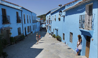
Smurf up near Marbella - Branding a Town

If you are looking for a family day out with a difference,  near Marbella? Visit the World's first Smurf Village Located off the Ronda Road in a town called Júzcar, you can still take the chance to visit following a surprise pre-christmas vote.

In June 2011, Sony Pictures took the bold decision to paint the whole of this traditional 'pueblo blanco' of Júzcar, a vivid smurf blue as part of the launch campaign for The Smurfs 3D.  The film was one of the surprise hits of the summer, despite mixed reviews, opening to $35.6 million and earning more than $75 million in its first 10 days;  success in part attributed to this real 3D branding campaign.


The Smurfs or "Los Pitufos" in spanish,  were given their new 'home' when Jùzcar was chosen to be the host location for the film's premiere. As part of the arrangement with the local residents,  Sony promised to return the city to its traditional white once filming was completed at the end of 2011. The 175 buildings took a dozen painters and over 1,000 gallons (approx. 4,000 litres)  of blue paint to be transformed into a phenomenal spectacular within the Malaga mountains. Even the church was transformed, and every detail was accounted for.


Now,  in a pre-christmas referendum, the 221-strong population took a vote to decide the future of the town and a majority of 141 residents (64%) opted to keep the Smurf branding.  The town will remain with its bright blue after enjoying a huge boost in tourism, ordinarily expecting less than 300 visitors during an average summertime , last year they received a staggering 80,000 visitors.  This improved level of tourism (and resulting profits)  will hopefully continue throughout 2012 bringing new sources of revenue to the local area and local businesses which can then be boosted again the following year in 2013,  because we hear already that Sony's Smurfs 2 will be released on August 2, 2013. 


For directions to visit from Marbella to Júzcar please see:  http://g.co/maps/6u5wk

HAPPY NEW YEAR from PUDDING CREATIVE
images and some article facts sourced from:- http://www.huffingtonpost.com/2011/06/18/smurf-town-juzcar_n_879834.html#s294451

Monday 2 January 2012

PUDD FILE: Capturing the everyday(2) - featuring extracts from About A Boy

It just depends on how you look at it....
A narrated animation : Capturing the everyday and finding the extraordinary in everyday life........a selection of free download imagery via http://www.dreamstime.com - The new expression of the 'throw-away' era in which we  live whereby some images are deemed to have no  value ...and yet others require a credit rating. 

However some of these free images contain absolute gems of observation.   Much like our chosen text.  The narration is taken from literary extracts by ~Nick Hornby, About a Boy (1998),  http://www.penguin.co.uk/static/cs/uk/0/minisites/nickhornby/books/aab_synopsis.html a writer who pays tribute to the genius of everyday and captures the very best of  people's expressions and behaviours like gems ....a few of my favourites: 


'We're vegetarian,' said Marcus. 'But we eat fish.'

'So we're not really vegetarian.'

'We don't eat fish very often though. Fish and chips sometimes. 
We never cook fish at home, do we?'

'Not often, no.'

'Never.'
 
'Will, this is Imogene. You can hold her if you like.'
'I suppose…okay. Yeah. Got her. Lovely. Yeah, she’s, um…delightful, isn’t she?'
'I know. Isn’t she?'
'To tell the truth Chris, I’m being a bit crap with her. You better take her back. Oh.'
'Hey, just think she could’ve been yours if you got your act together.'
'Just think of that...'
(extract from film script dialogue About A Boy -2002)


"All of a sudden you became better-looking, a better lover, a better person ... Great sex, a lot of ego massage, temporary parenthood without tears..."
 
 "If a girl and a boy met, and they didn't have a boyfriend or a girlfriend, and they both looked all right, and they didn't mind each other, then they might as well go out together. What was the point in not?"


"There was, he thought, an emotional truth here somewhere, and he could see now that his role-playing had a previously unsuspected artistic element to it. He was acting, yes, but in the noblest, most profound sense of the word." 


  "I was really scared because I didn't think two was enough, and now there aren't two anymore. There are loads. And you're better off that way." 


Pudding Creative :  seeking out the extraordinary everyday.
www.puddingcreative.com

Friday 30 December 2011

Last day in the office 2011 - Top online brands 2011 (US)

Jump_Fish_Jump_by_chameleonkid
For many, today will be the last day in the office for 2011 and as we prepare to jump into 2012 we wanted to take a look back at some of the amazing stats from these previous months.  As so much of this year will have been spent online for both work and pleasure,  we thought we would post a copy of this list of the most visited brands in the US from 2011

Since all of our online hours are sure to rise from those seen in 2010,  where 'The average American spent 32 hours per month on the Internet in 2010. Persons ages 45-54 set the high bar averaging more than 39 hours online each month' (source:- http://www.comscoredatamine.com) it is almost mind-blowing to try to quantify the impact of successful online branding.  

These figures (below) have been sourced from the gurus at Nielson and indicate that Google will likely top the charts for 2011 :  Between January and October of 2011, an average of 153.4 million people visited Google sites per month...(and) over 60 percent of web searches in the U.S. are done through Google.(source:- Neilson.com)  

The interesting fact to note is how these figures demonstrate the boundaries between work and pleasure fading, as the mix of social and business networking coupled with rising informative bodies draws closer.  

Wishing you all a great New Year's weekend,
and a very happy and successful start to 2012.
From us all at 
Pudding Creative x


Rank Web Brand Avg # of Unique Visitors (000)
per month
1 Google 153,441
2 Facebook 137,644
3 Yahoo! 130,121
4 MSN/WindowsLive/Bing                115,890
5 YouTube 106,692
6 Microsoft 83,691
7 AOL Media Network 74,633
8 Wikipedia 62,097
9 Apple 61,608
10 Ask Search Network 60,552

    Data from January – October 2011, Home and Work Computers. Ranked on average monthly unique audience.


Read as: During 2011, 153.4 million U.S. people, on average, visited Google sites from home and work computers


Source: Nielsen  http://blog.nielsen.com/nielsenwire/online_mobile/nielsens-tops-of-2011-digital/